

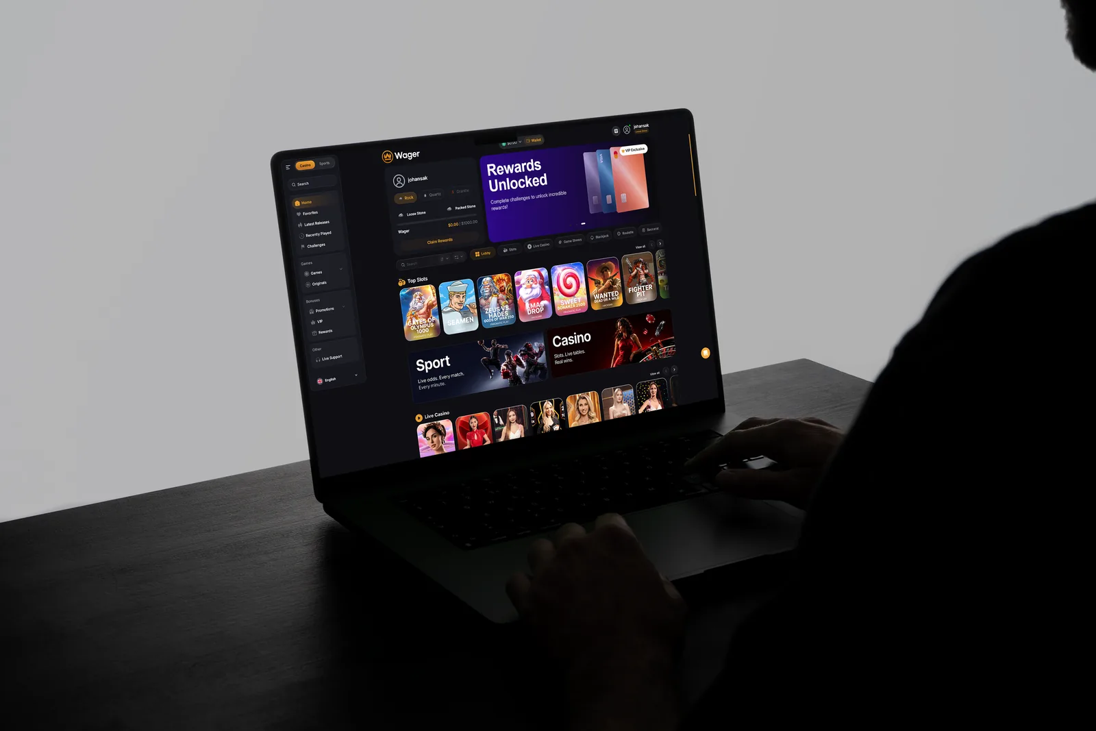
Task
Metrics I looked at
Registration completion, signup-to-first-game, time to first game, registration-to-deposit, session length, early retention, churn rate, bounce rate and time on promo pages, CTR on new ad creatives.
Process
I had two months in total, so I dropped in-depth interviews in favour of a survey and session recordings: the survey gave direction, FullStory explained behaviour.
The main drop was on verification inside registration. Promo pages had a high bounce rate and generated a lot of support tickets.
People did not drop because the form was long. They dropped because documents were required at all: a person came to play and got a procedure he was not ready for.
50 people. Promos were ignored because the wagering terms were unclear, not because the bonus was too small. Part of the audience is not ready to put money into a product they do not know. survey link
I compared the entry into the product, game discovery and how promos are presented in other iGaming products. I took the live chat idea from there.
Ads, landing pages and the product read like three different companies. JTBD: understand the value before paying, find a suitable game fast, understand bonus terms, know the next step at every stage.
Problems
KYC stopped the user at the moment of highest motivation
The homepage showed a lot but did not help to choose an action, and the size of the catalogue made the choice harder
instead of a clear offer the user got unclear wagering terms
After the deposit there was no reason to come back
Touchpoints looked like different products
Solutions
I moved verification to the withdrawal step and left three fields in registration. The licence allows verification on withdrawal, so the change did not affect AML obligations.
Rejected options
Simplify the verification form.
The barrier was not the form, it was the request for documents
More people finish registration, and noticeably more get from registration to the first game.
I rebuilt the homepage structure and navigation around user tasks: find a game, get the first experience, come back. I split the content by player types instead of one common flow, reworked the catalogue and filters, and added personalised recommendations.
What else I considered
Rejected options
A shared hub where casino and sports betting sit together with personalisation
sports was outside my scope of work at that time, and the hub meant rebuilding the whole concept
Players get to their first real money game faster, stay longer per session and more often reach the deposit after registration. Early returns also grew, but a two week window is too short for this metric, so I read it as a direction
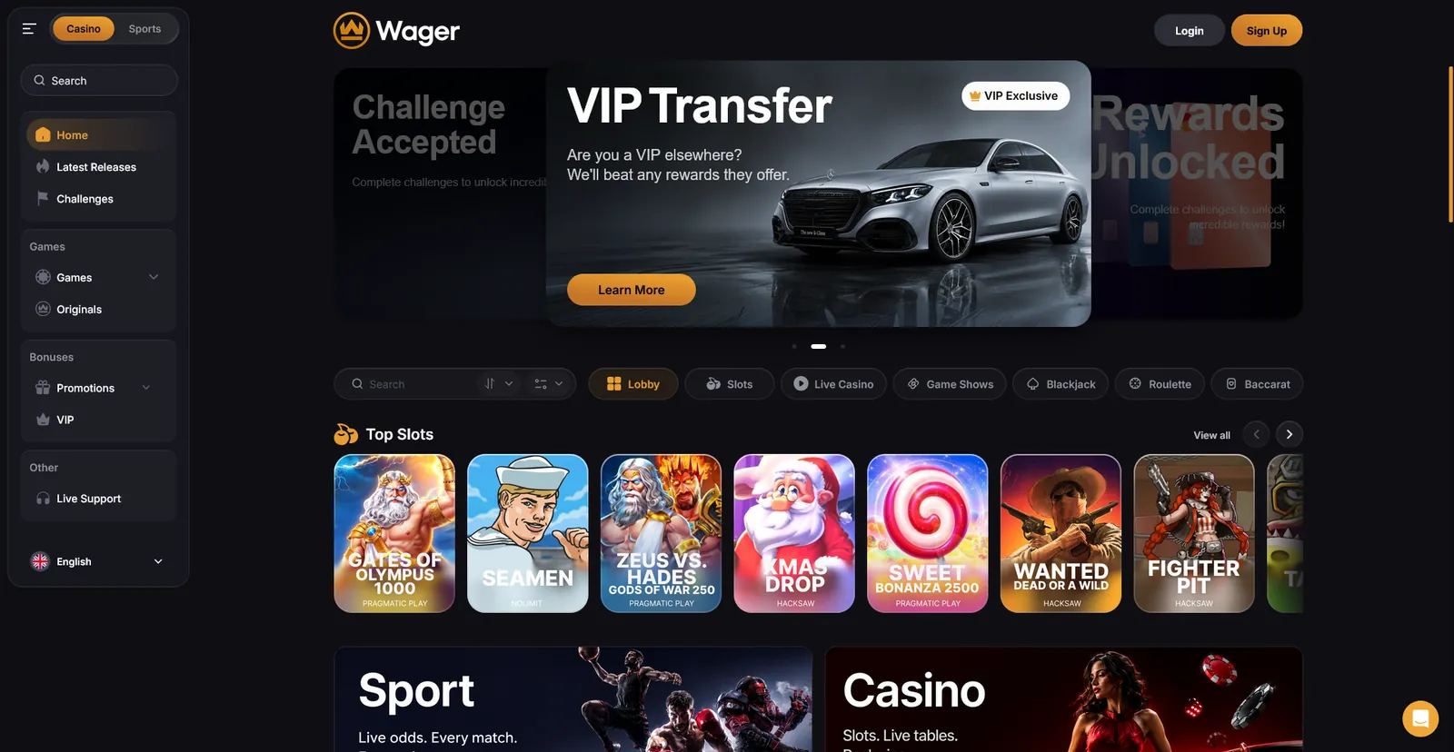
I rebuilt the page structure completely. I changed the hero so the offer reads immediately, moved the wagering terms out of the fine print, added the steps to claim the bonus, and reworked typography, accents and CTA
Fewer people leave the page right away, and they spend more time reading the terms.
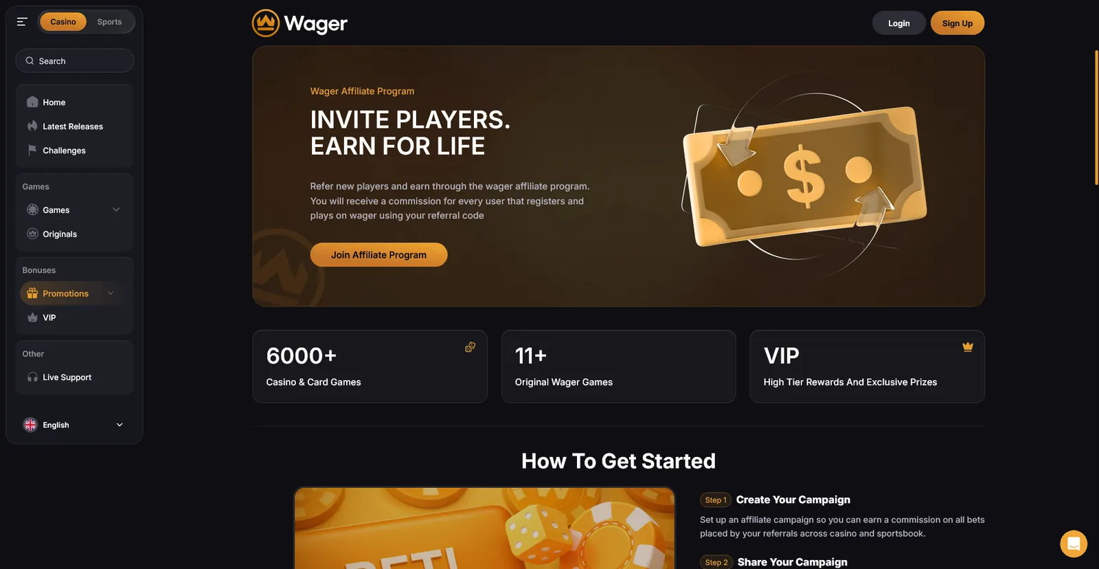
[4] VIP Transfer
(players with a high status on another platform do not want to start from zero)
The page existed, but analytics showed it did not work
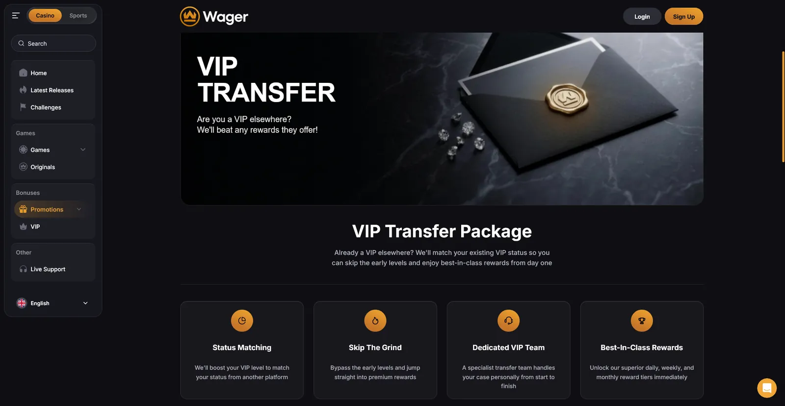
I reworked the logic and the structure: clear terms for transferring the status, a readable sequence of steps, a new way of presenting the offer
Fewer people bounce off the offer, and more of them read the transfer conditions through to the last step
There was no design system. I built it from scratch: first an inventory of what already lived in production, then adaptation to the new visual language.
Hypotheses
Problem
You could only see how the product works after registration
Hypothesis
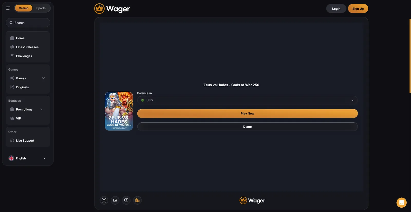
If people can try games without registration and without a deposit, more of them will reach the first value moment and then registration
Solution
I opened the demo mode for unregistered users
Tested before release: hallway testing on the prototype, checking whether people understood they could play without an account and what they expected to happen next After release: A/B test, two week window. Watched conversion from demo to registration, first time deposit and signup-to-first-game Outcome: confirmed and live. More people reach the first game, and fewer leave without ever seeing the product
Problem
After the deposit there was no regular reason to come back
Hypothesis
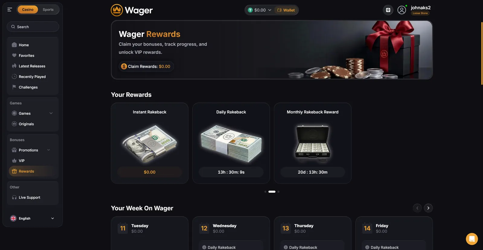
Daily goals with a reward will create a reason to come back
Solution
I designed the whole mechanic: task structure, mission types, rewards, economy balance. The main argument was about the economy: a generous reward brings people back, but the mechanic gets farmed instead of played, while a weak reward is safe but does not build a habit. I solved it through difficulty: the reward grows with effort, and mission types are split by activity segments
Before release: a diary study with 4 people from the target audience over 3 days, to see whether the daily goals actually pulled them back the next day and how the rewards felt over time, not just on first sight After release: A/B test, two week window. Watched retention and churn rate Outcome: confirmed and live. Players come back more often after the first deposit. Two weeks is a short window for retention and churn, so I read the effect as a direction
Problem
A large catalogue made the choice harder. The user saw the volume but did not see where to start
Hypothesis
A relevant selection instead of the full catalogue will shorten the path to a game
Solution
Personal recommendations on the homepage and in the catalogue
Before release: tuned the selection logic so the shortlist matched the player's own interests instead of showing generic popular titles Outcome: confirmed and in development. Players find a game they want faster and stay in the session longer
[1] Live Chat
Chat will raise session length through social interaction, not through new games
Result
The brand became the same across all touchpoints. Ads, landing pages, promos, emails and the product stopped looking like three different companies
Registration stopped breaking on documents
The product started to guide, the homepage and the catalogue suggest the next step, and recommendations shorten the path to the first game
After the deposit there is a reason to come back