

Goal
Problem
People leave after something breaks
Nobody switches banks because another app looks nicer. They switch after something goes wrong. One person moved banks after his accounts got frozen the moment his mobile internet dropped, with no warning and no way in.
Some users don't want to figure anything out
Not everyone wants to learn a banking app. In the interviews people said “I don't get into it” and “I don't really understand this stuff”. For them the app has to work on the first try, or they're gone.
Transfers are the whole point
Every person named transfers as the thing they use the app for most. And slow transfers were the thing they complained about most. If transfers are heavy, the app is heavy.
Design and comfort
People notice design and comfort, and it's a real reason to stay. But it never comes first. If the basics don't work, no amount of polish saves it.
Research
Benchmarking
- Sign-up is long everywhere, four to six steps before you reach the app
- Most apps put every function on one screen with no grouping
- Revolut stays minimal, but some screens feel unfinished
- Older banking apps have the features but look and move like 2015
Interviews
- Send money fast, without extra steps
- See where the money goes
- Get help without waiting or explaining a lot
Personas
You can view the entire research
Process
Brief and spec
Analysis
Structure
Screens
Design system
Testing
Hypotheses
[1] Send to several people at once
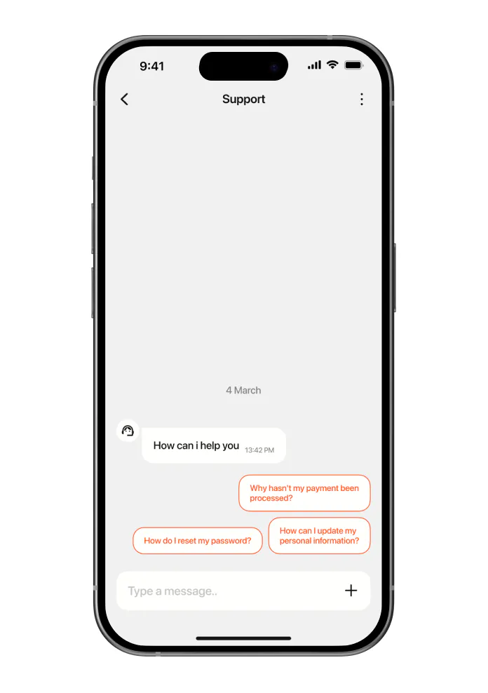
[2] Quick questions in support
[3] Cashback as a shared pot
Wanted to build
Implementation
Registration
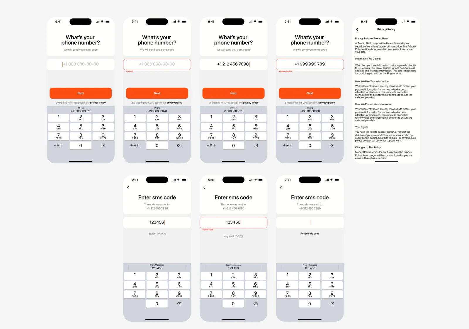
- Kept the flow to the steps people already know: phone number, sms code, a four-digit passcode
- Added Face ID from the second launch, so the user gets in with one look instead of typing a code every time
- Drew the error states into the flow, wrong code and code not received, so sign-up never turns into a dead end
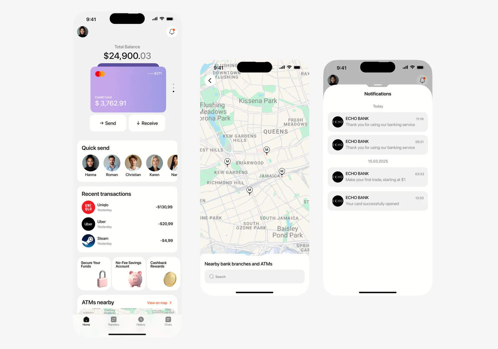
Main screen
- Put a map of nearby ATMs right on the main screen, so when the user needs cash they don't have to search for it
- Added a spending block with recent transactions, so the last movements are visible without opening history
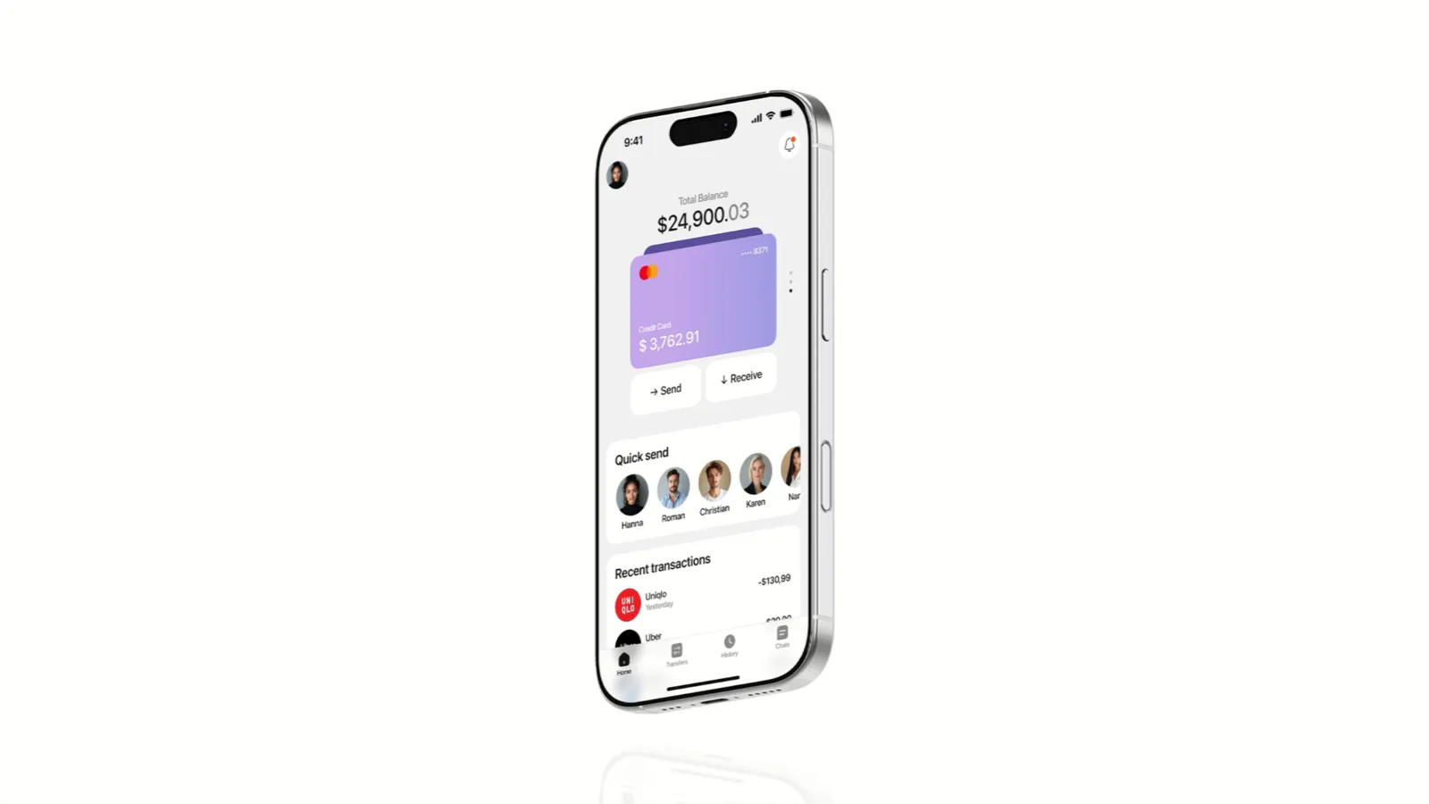
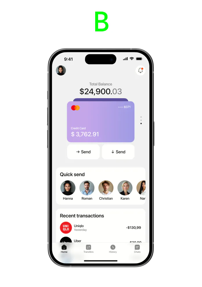
- Put the balance and the card at the top, the first thing people open the app to check
Account screen
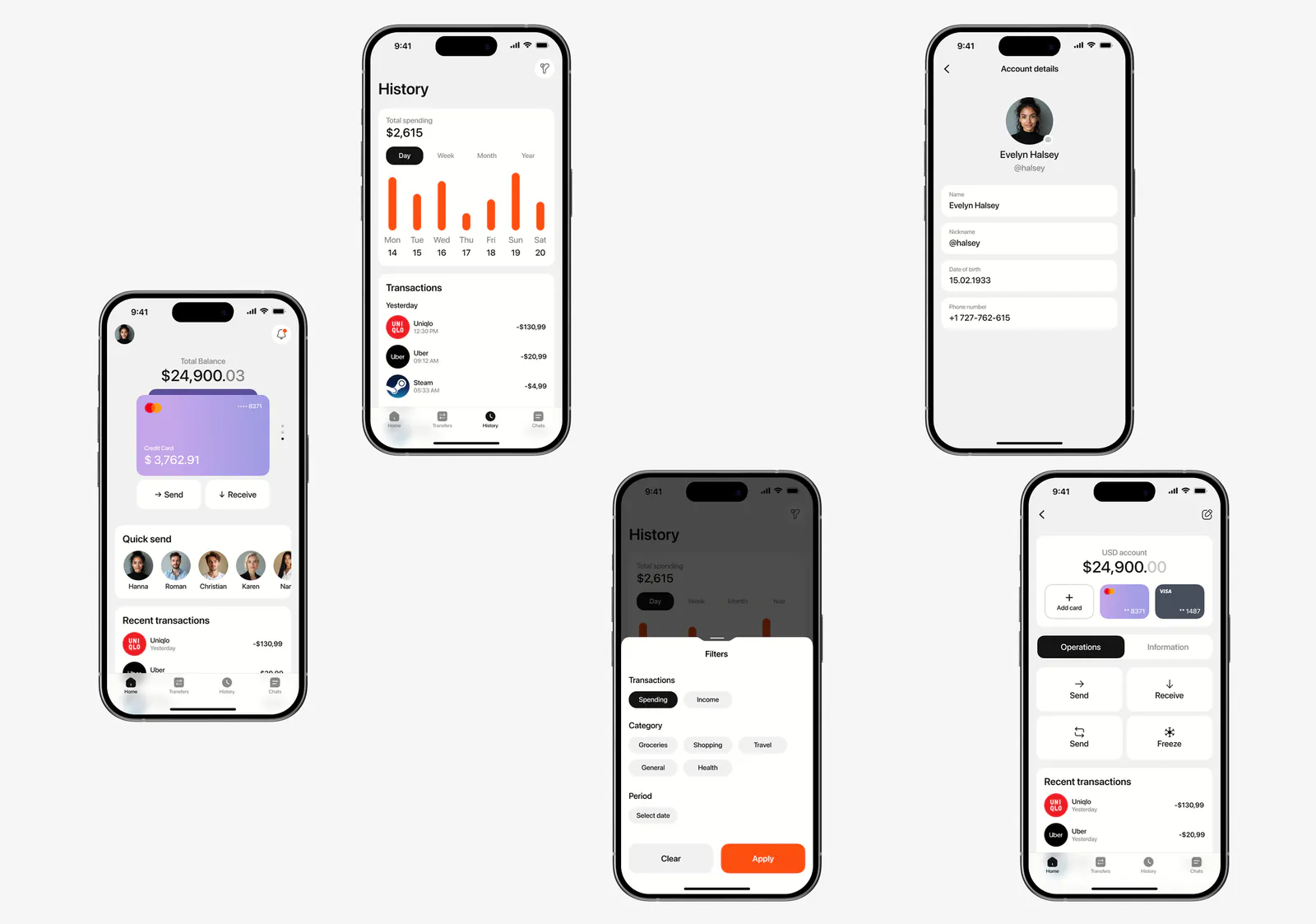
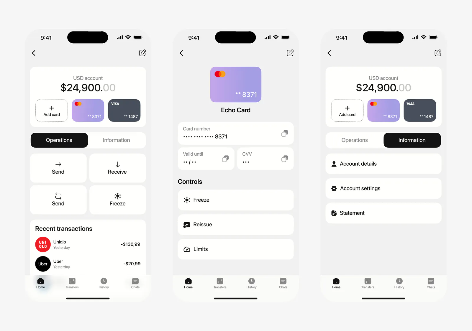
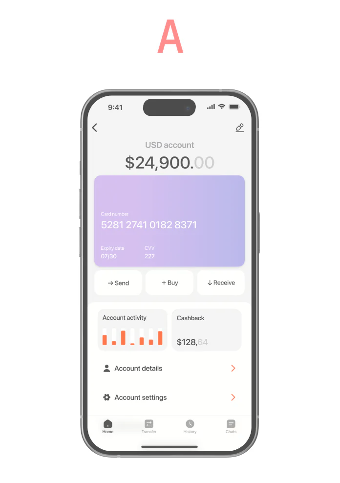
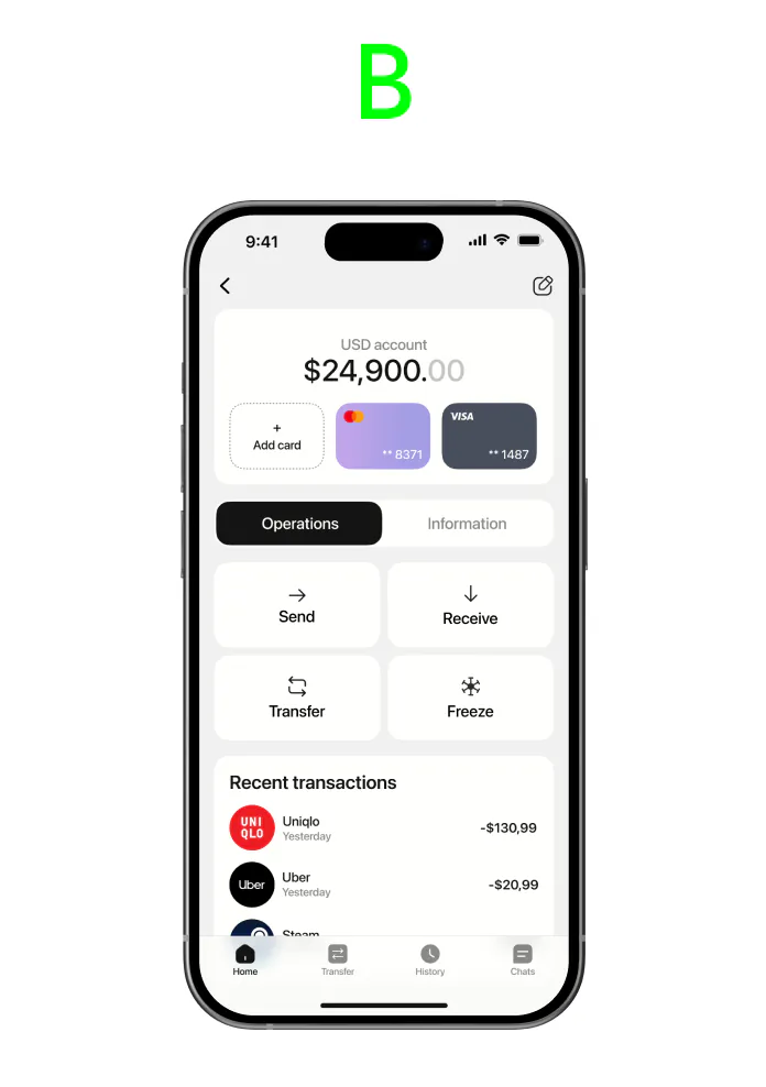
- Split the screen into two tabs, Operations and Information, because the A/B test showed one flat screen with every function was too much at once
- Kept the actions in Operations and everything you look up in Information, so doing something and checking something are two different modes
- Drew the error states into the flow, wrong code and code not received, so sign-up never turns into a dead end
Transfers
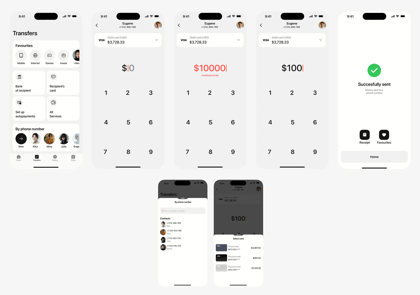
- Added every way people actually send money: by phone number, card, QR, or between their own accounts
- Kept the flow short, pick a contact, type the amount, confirm, so the most common action takes the fewest taps
- Put contacts and templates on the transfer screen, so a repeated transfer doesn't start from scratch
A/B testing
Result
Echo went from a brief to a full product: research, structure, flows, screens, and a design system. The main calls were checked against real people, not taste.
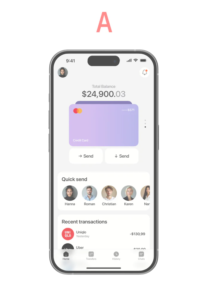
Two screens changed because of testing. The account screen dropped half its noise once the functions moved into tabs. The main screen got per-card balance, because that's what people looked for first.